I joined a group on Facebook last year called “Quilt Design A Day.” The point of the group is to spend 15-20 minutes working on new quilt designs. The moderators provide the group with 1 or 2 color palettes a day and an inspiration photo, usually from Design Seeds (though not always) and you are supposed to design a quilt. You post a picture of your design in the group and it is wonderful for positive feedback. I’m also using this as an opportunity to sharpen my EQ7 skills.
I thought I might share a couple of my designs from last week with you. Most of the color combinations I would never pick but that’s part of why I like this group. It challenges me to go outside my comfort zone.
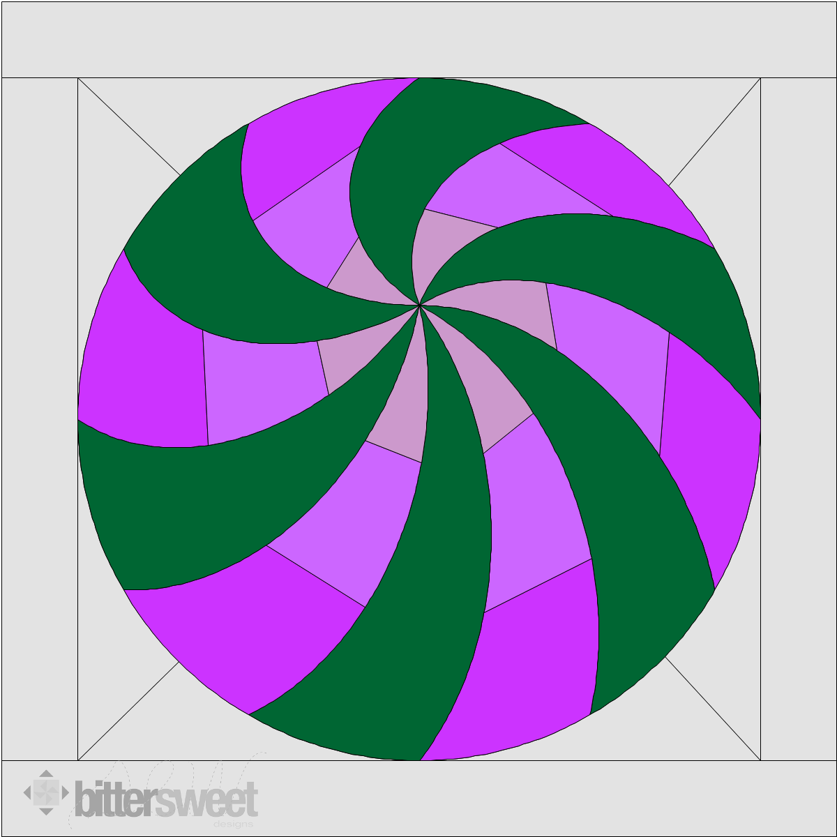
This one is called “Hypnotic Spring”. I was playing with circles and curves. These aren’t colors I would put together but they were the inspiration colors.
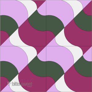
 This one I called “Ebb and Flow”. It reminds me of waves and ripples in a pool of water. Again not my colors but I do like the overall effect.
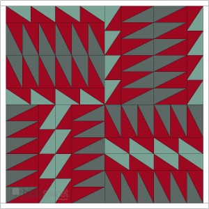
 This one I named “The Safe Path”. Sometimes the safe path is the scary looking one. I like the colors better on this one and might even change the coloring at some point but for now, I will keep it like this.
If you follow me on Instagram, you will have seen these start popping up last week so I’m sorry for boring you, but for everyone not on IG this is what I’ve been up to in design world. I am thinking of these as warm up exercises for my quilt designs.
Have a wonderful and happy Monday!


So these designs are just on EQ for now? Sounds fun. No Cutting of fabrics required. I like the colors in the top 2 designs.
I’m so glad you’ve joined us! 😀 I’ve been loving seeing your designs and look forward to seeing more. 🙂 I really love The Safe Path design. That’s really powerful!
Not boring at all. It might be fun, if I did fb or instagram. And I don’t have EQ. Or any other design software beyond a pencil and paper. LOL I always like seeing where your mind is going, though. Both of the first two started my mind jumping to put things together. They are well balanced. I think it’s so interesting that colors make a difference in what we think of a design. I wonder if the third one had been in the same color range as the first two if I would have liked it more.
I think they are all pretty cool especially the last one! Reminded me out lighting flashes we get here!